
Roofing website examples: four NZ roofers, before and after

Not mockups. These are live roofing company websites we rebuilt, with the old version alongside. For each one we've scored the five things that decide whether a homeowner calls.

Last updated

What we look for on every roofing website

We judge a roofing website on five things: whether the first screen says what you specialise in and where, whether proof (rating, years, guarantee, accreditations) is visible without scrolling, how many steps it takes to request a quote, how it reads on a phone, and how fast it loads. Each example below is scored before and after on those five.

  1. First screen

    Specialty and location named

  2. Proof

    Visible without scrolling

  3. Quote path

    Steps from landing to enquiry

  4. Mobile

    Readable, tappable, sticky call button

  5. Speed

    Loads under two seconds on 4G

Entire Roofing Solutions logo Before 1/5 After 5/5

Entire Roofing Solutions: from "we do all roofing" to Auckland's flat-roof specialists

Membrane and flat roofs, Auckland

Before the redesign

Before
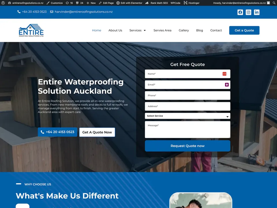
Entire Roofing Solutions roofing website, before redesign, desktop view
  • The headline described roofing in general. Nothing told a homeowner with a leaking membrane roof that this was the company for them.
  • A long form sat next to the headline, asking for the job before the site had earned it.
  • Photos were interchangeable with any other roofer's. The repeated service blurbs made the company feel smaller than it is.

After the redesign

After
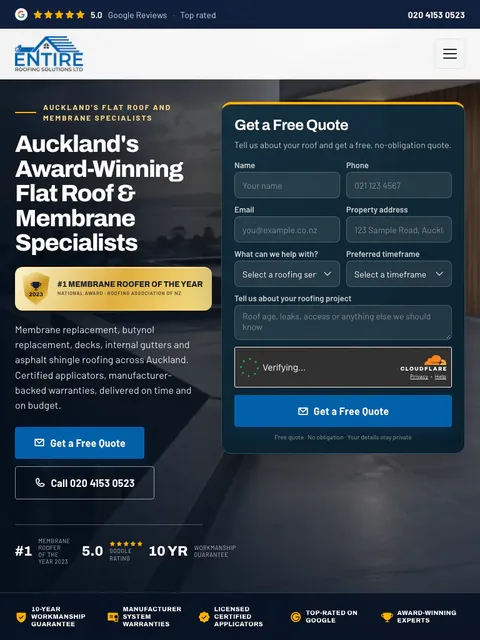
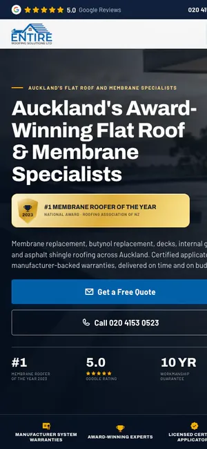
  • The first screen now says membrane and flat-roof specialists, Auckland. The right customer knows in two seconds.
  • Awards, review score, years in business, guarantees and service areas run through the page, not stacked at the bottom.
  • Before-and-after job photos, a page per service, a short process section, project gallery and FAQ walk the visitor to the quote request.

Visit entireroofingsolutions.nz
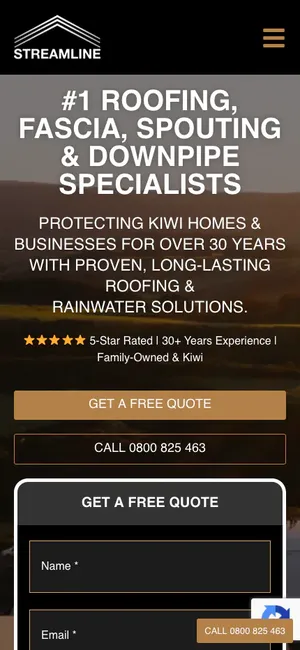
Streamline Roofing logo Before 2/5 After 5/5

Streamline Roofing: from a service list to a lead engine

Roofing, fascia and spouting, Palmerston North

Before the redesign

Before
Streamline Roofing roofing website, before redesign, desktop view
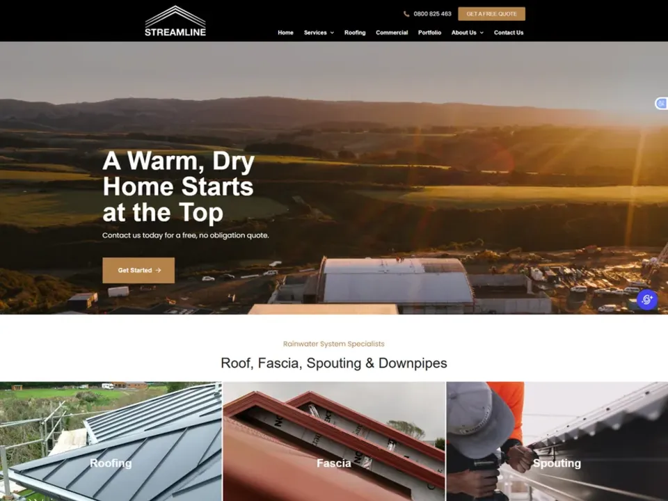
  • Services were listed, but the hero gave no reason to choose Streamline over the next three results.
  • Trust rested on "years of experience" with no customer evidence to back it.
  • The only way to ask for a quote was a button that led somewhere else. No form on the page meant no way to capture a homeowner in the moment.

After the redesign

After
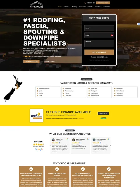
  • One specific headline states the complete roofing offer up front.
  • Google reviews, finance options, a guarantee and project photos appear in sequence as the visitor scrolls.
  • A quote form sits in the first screen and a phone CTA repeats after every section.
Visit streamline.kiwi
Payless Roofing logo Before 1/5 After 5/5

Payless Roofing: proof before the form

Re-roofing, Auckland

Before the redesign

Before
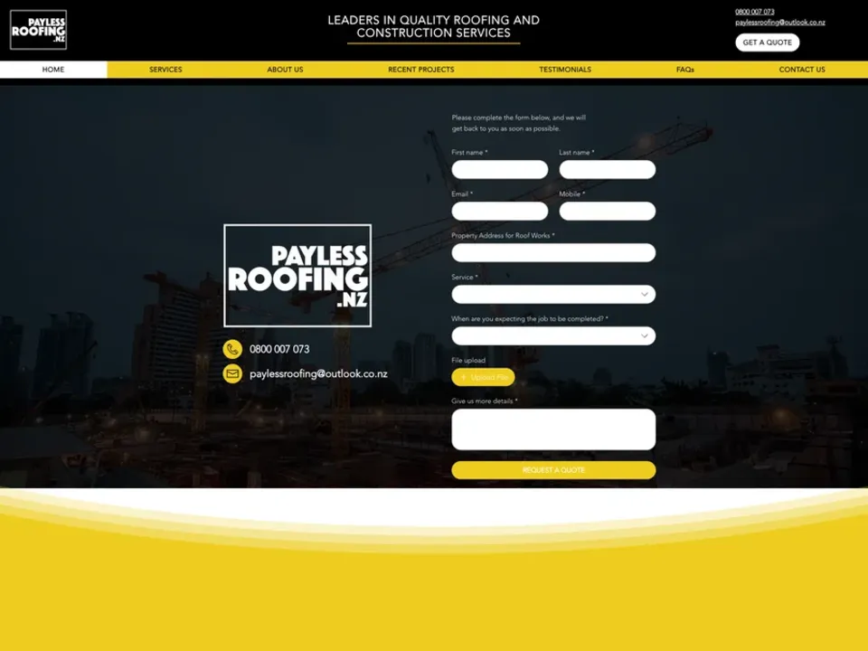
Payless Roofing roofing website, before redesign, desktop view
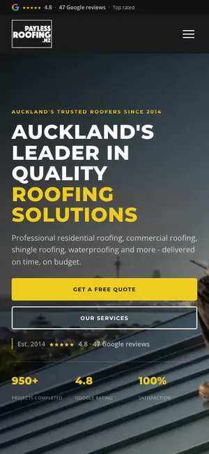
  • The old Wix site opened with a nine-field quote form. A homeowner was asked for their roof details before they knew who Payless were.
  • "Roofing and construction services" blurred the offer, and the actual services hid in a dropdown.
  • Trading since 2014, 950+ projects and a 4.8 Google rating: all true, all buried.

After the redesign

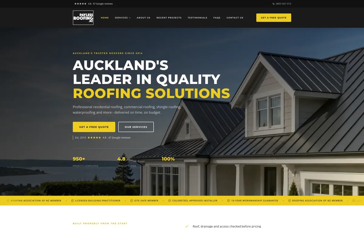
After
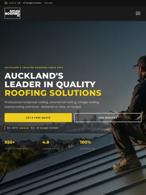
  • A location-led headline and named services make the offer clear in the first screen.
  • Accreditations, the review score and the 10-year workmanship guarantee sit next to the call button.
  • The same proof now opens the page, and each service has its own photos and its own page.
Visit paylessroofing.nz
Modern Roofing logo Before 2/5 After 5/5

Modern Roofing: a brochure page turned into a premium trade brand

Premium residential roofing, Auckland

Before the redesign

Before
Modern Roofing roofing website, before redesign, desktop view
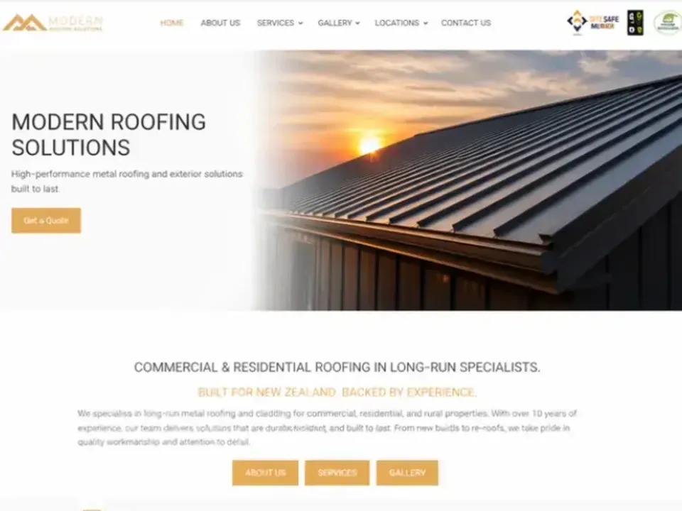
  • Flat layout, weak hierarchy, no sense that this was a quality operator.
  • Generic content blocks that gave no reason to pay a premium price.
  • The call to action was there, but you had to look for it.

After the redesign

After
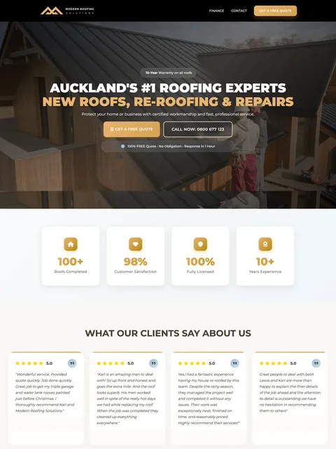
  • A sharper brand with trust cues in the first screen.
  • Content paced so the visitor reads the offer, sees the proof, then meets the form.
  • A visual finish that matches the price of the work.
Visit modernroofing.co.nz
“Nick and the team have been fantastic to work with. They set up and now manage our Ads campaign with clear reporting and measurable results, and they also designed our website.”
Karl Bagshaw · Owner, Modern Roofing

What the best roofing websites have in common

The best roofing websites name a specialty and a location in the headline, show proof before asking for anything, make the phone number tappable from every screen, use photos of real local roofs, keep the quote form to four fields, and load in under two seconds on a phone.

  1. A headline that says what and where

    "Long-run re-roofing, Christchurch" beats "Welcome to our website".

  2. Proof in the first screen

    Rating, years, jobs, guarantee, accreditation.

  3. A tappable phone number

    One that follows the visitor down the page on mobile.

  4. Real photos of real local roofs

    Including the crew. No stock shingles from Colorado.

  5. A four-field quote form

    Everything else gets asked on the call.

  6. One page per service, one per area

    So Google has something specific to rank.

  7. Under two seconds to load on 4G

    Most homeowners check a roofer on their phone, often standing in the driveway looking up.

Want to see where your roofing website stands?

Send it through. We'll score it on the same five points and send you the video.